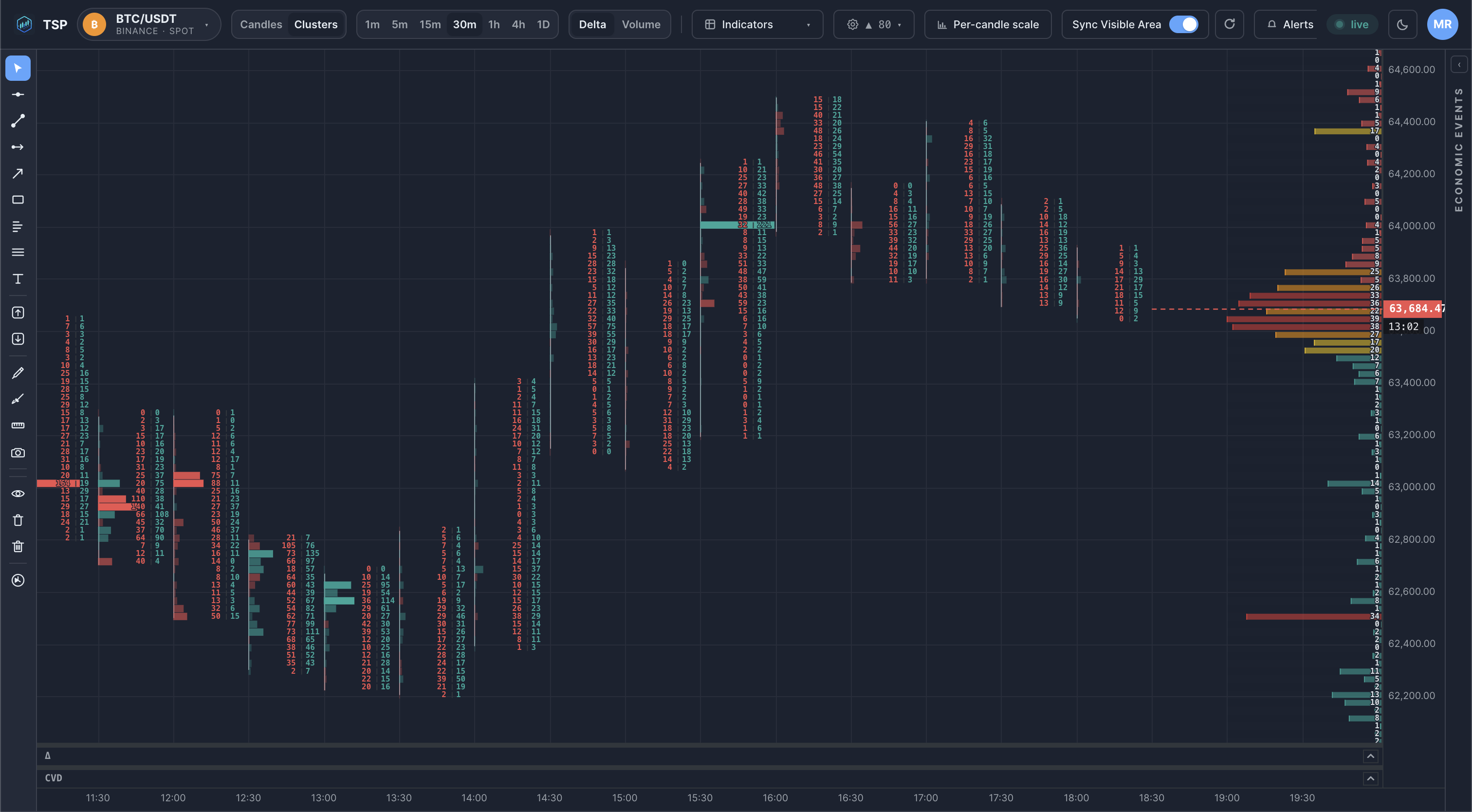
What Is a Footprint Chart?
A footprint chart is a candlestick chart that also exposes the volume traded at each price level inside every bar — split into aggressive buying and aggressive selling — so you can read order flow at the level of individual prints.
How footprint charts work
Every trade that executes does so at a specific price and on a specific side: either an aggressive buyer lifting the offer or an aggressive seller hitting the bid. A footprint chart groups those trades into price bands within each bar and tallies the buy and sell volume at every band. Instead of a solid candle body, you see a column of price levels, each annotated with how much traded there and which side was the aggressor.
The result reveals the internal structure of a bar: where the heaviest activity sat, whether one side dominated at a given level, and how the most-traded price drifted as the bar formed.
Footprint chart vs candlestick chart
A candlestick chart and a footprint chart describe the same bars, but at very different resolution.
| Candlestick | Footprint | |
|---|---|---|
| What it shows | Open, high, low, close for the bar | Volume at every price level, split by bid/ask |
| Resolution | One bar = four numbers | One bar = a full distribution |
| Answers | Where did price go? | Where did the volume happen, and who was aggressive? |
| Best for | Trend and structure at a glance | Order-flow reading: absorption, imbalance, exhaustion |
Why bid/ask volume matters
The bid/ask split is what separates a footprint from a plain volume histogram. Knowing that 400 contracts traded at a level tells you the level was active; knowing that 380 of them were aggressive buys tells you who was active. That distinction is the core of order-flow analysis:
Reading the split helps you spot:
- Absorption — large aggressive selling that fails to move price down, implying resting buyers are absorbing it.
- Imbalance — a level where one side's volume far outweighs the other's.
- Exhaustion — aggression thinning out at the extreme of a move.
These are descriptive readings of completed activity, not predictions about what price will do next.
Example
FAQ
What is a footprint chart?
A footprint chart is a candlestick chart that also shows how much volume traded at each price level inside every bar, split into aggressive buying and aggressive selling. It turns a single bar into a detailed map of order flow.
How is a footprint chart different from a candlestick chart?
A candlestick shows only open, high, low and close. A footprint keeps the bar shape but fills in the volume traded at each price level, with the bid/ask split — so you can see where inside the bar activity happened, not just the range it covered.
What timeframe is best for footprint charts?
Footprints are most useful on lower timeframes where individual trades are still distinguishable — typically 1-minute to 15-minute bars for crypto. On higher timeframes the level-by-level detail blurs together.
Do footprint charts predict price?
No. A footprint chart describes how volume was distributed in bars that have already traded. It is analytical context, not a signal or forecast.
Read footprints on live crypto data
Open the TSP Core dashboard and watch bid/ask volume build inside every bar in real time.