Cluster Charts
A cluster chart is the visual form a footprint takes: each bar is split into horizontal price bands, and every band shows the volume that traded there. It turns the abstract idea of "volume inside a bar" into a shape you can read at a glance.
What is a cluster chart?
Where a footprint chart is about the numbers at each price level, a cluster chart is about the picture those numbers make. Trades are grouped into fixed-size price bands — for example $50 or $150 wide on a high-priced asset — and each band is drawn with a length or colour intensity proportional to its volume. Stacked vertically, the bands form a profile inside the bar that shows where activity concentrated.
Crucially, clusters are scaled by price, not by time. A wider band setting compresses detail into broad zones; a narrower setting resolves individual levels. The same trades can be viewed coarse or fine just by changing the band size.
Why does it matter?
Two bars with the same range can have completely different internal shapes. A cluster chart makes the shape obvious:
- Concentration — a fat band where most volume pooled, often a level price respects later.
- Distribution — volume spread evenly, suggesting a smooth move rather than a fight at one price.
- Gaps — thin bands price moved through quickly, where little was actually traded.
These are visual descriptions of where volume sat — order-flow context, not a forecast.
How traders use it
Cluster charts are typically read on intraday timeframes, where the band shape of each bar is still meaningful:
- Spotting the heaviest band of a bar and watching whether price returns to it.
- Comparing the band profile of an up-move against the following pullback to see whether volume builds or thins.
- Adjusting band size to zoom between a broad view of zones and a fine view of individual levels.
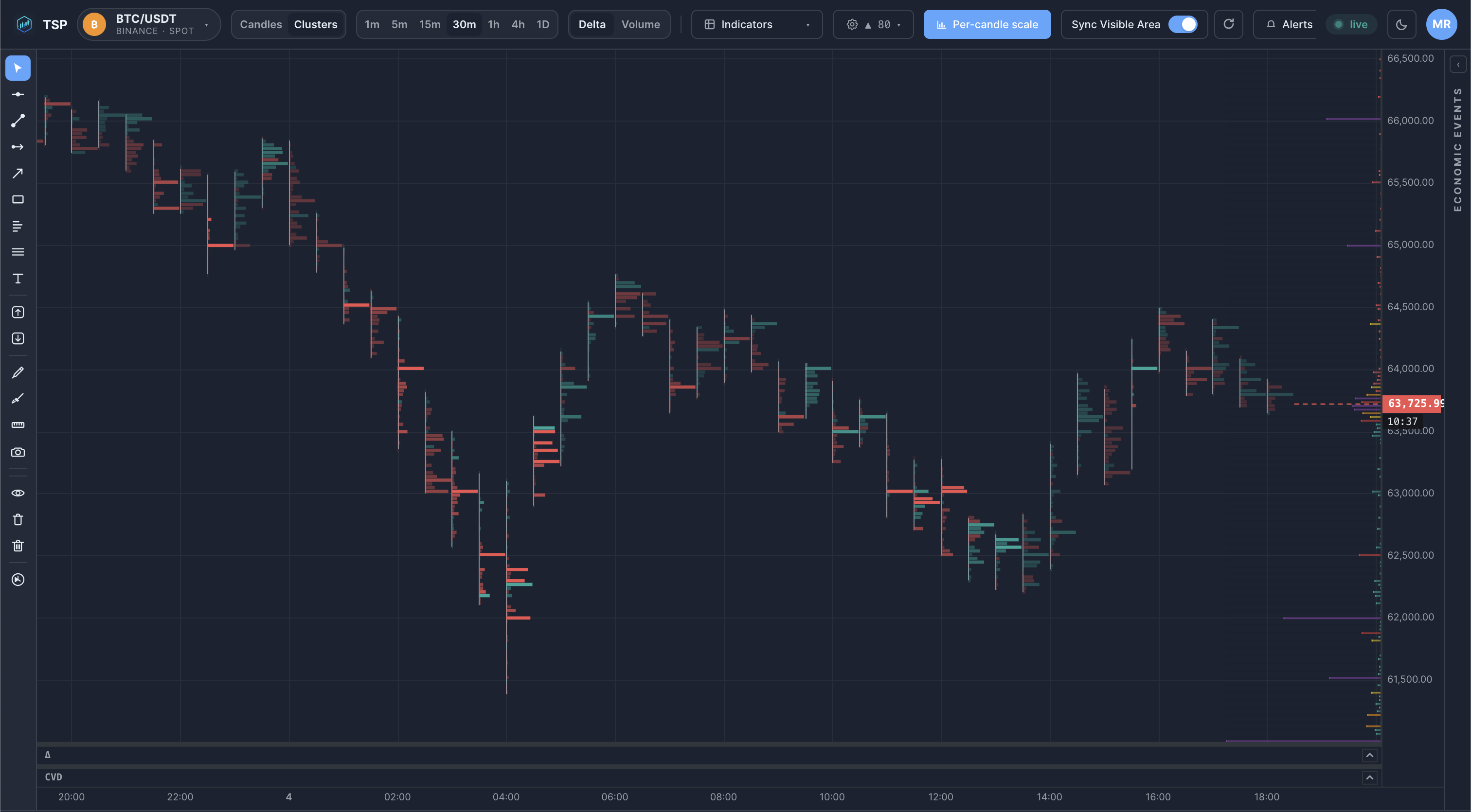
Example on a chart
Common mistakes
- Picking the wrong band size. Bands too wide hide the detail; too narrow and every bar looks noisy. The right scale depends on the asset's price and your timeframe.
- Reading clusters in isolation. A heavy band matters far more when it lines up with a prior level, a volume-profile node or a session boundary.
- Confusing a big band with direction. High volume at a price says it was contested, not which side won — pair it with delta to see aggression.
How TSP Core visualizes it
TSP Core renders clusters on a dedicated canvas view, building each bar's bands live from real-time trades. Band size is configurable by price increment, so you can move between a coarse zone view and a fine level view without leaving the chart. The forming bar updates as trades print, and the completed bar locks to the same figures kept in history — so the picture you read live matches the one you review later.
See cluster charts on live crypto data
Open the TSP Core dashboard and watch each bar's volume bands build in real time.