Footprint Charts
A footprint chart shows the buy and sell volume traded at every individual price level inside a candle — turning a single bar into a detailed map of order flow instead of just four OHLC values.
What is a footprint chart?
A standard candlestick tells you only where price opened, closed, and how far it travelled. A footprint chart keeps that bar shape but fills it in: each price level inside the bar is annotated with how much volume traded there, split into aggressive buying (lifting the ask) and aggressive selling (hitting the bid). The result is a vertical column of numbers — or a colour-graded heatmap — that reveals where inside the bar the activity actually happened.
Because crypto markets trade continuously and print every transaction, footprint charts are a natural fit: the raw tape is rich enough to reconstruct the bid/ask split at each level without estimation.
Why does it matter?
Two bars can look identical on a candlestick chart yet describe completely different battles. One green bar might be steady accumulation across every level; another might be a single violent sweep with no follow-through. Footprint charts make that difference visible. They help you see:
- Absorption — heavy selling that fails to push price lower, suggesting resting buyers are soaking it up.
- Imbalances — price levels where buy volume dwarfs sell volume (or vice versa) by a wide margin.
- Exhaustion — thinning volume at the extreme of a move, where the last aggressors run out.
These are descriptive observations about how volume was distributed — not trading signals or predictions.
How traders use it
Order-flow traders typically read footprint charts at the lower timeframes where individual prints still matter — 1m to 15m for crypto. Common workflows:
- Watching the point of control (the most-traded level) within each bar migrate up or down as a trend develops.
- Looking for a cluster of buy imbalances stacking just above a support level before deciding the level held.
- Comparing the delta (net buy-minus-sell) of consecutive bars to gauge whether aggression is building or fading.
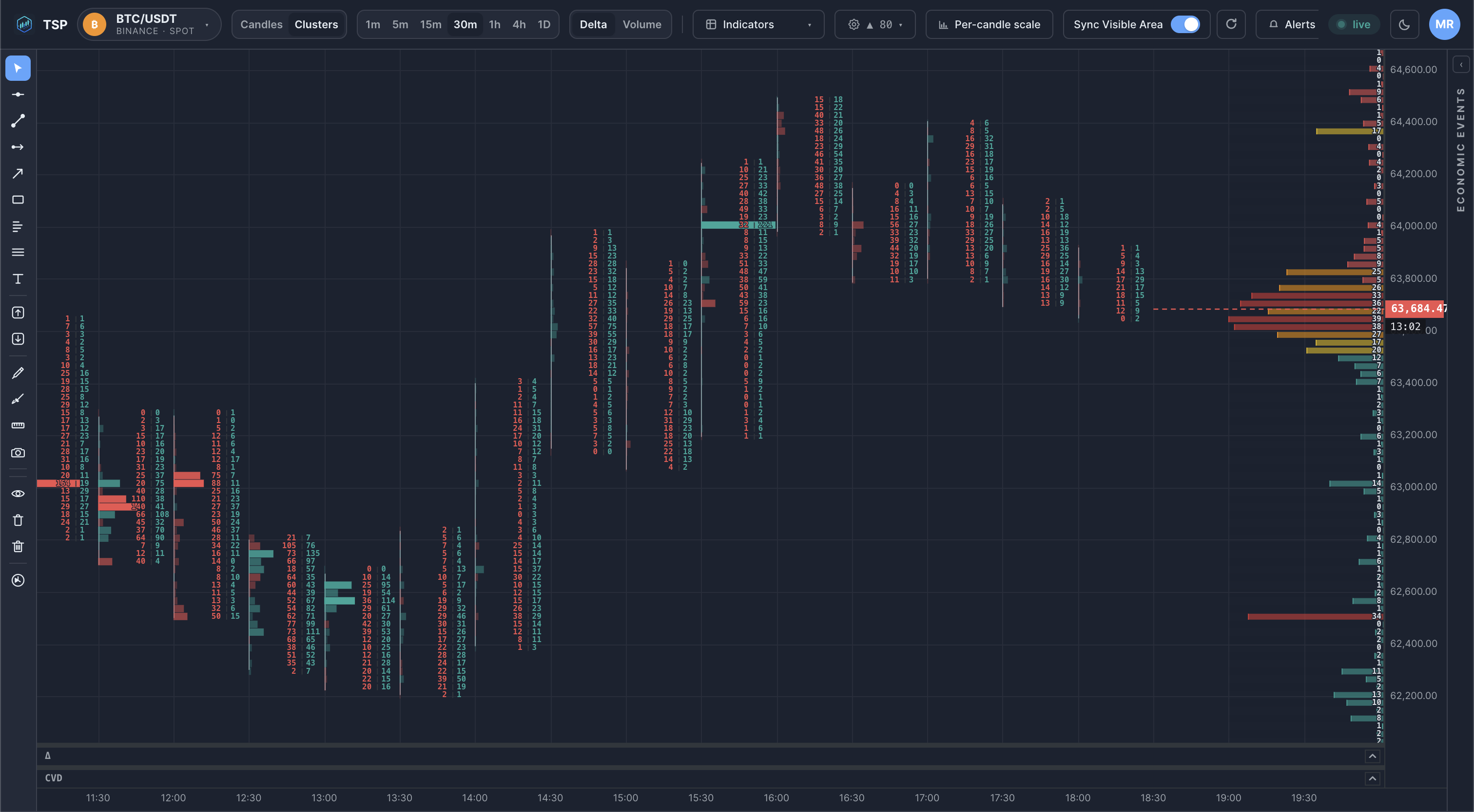
Example on a chart
Common mistakes
- Reading footprints on too high a timeframe. On a 4h bar the level-by-level detail blurs together; footprints are most informative on the timeframes where single prints are still distinguishable.
- Treating an imbalance as a signal. A lopsided level describes what already traded — it is context, not a forecast.
- Ignoring the surrounding structure. Absorption at a random level means little; the same absorption at a tested support or a volume-profile node is far more meaningful.
- Confusing volume with delta. A high-volume level can still have near-zero delta if buying and selling were balanced.
How TSP Core visualizes it
TSP Core renders footprints as live cluster columns directly on the price chart, updating from real-time market data as each trade prints. Every bar is divided into configurable price bands; within a band you can see traded volume and the buy/sell split, with the most active levels emphasised. The live forming bar updates tick-by-tick and the completed bar is locked to the same values that land in history, so what you watch in real time matches what you review later.
See footprint charts on live crypto data
Open the TSP Core dashboard and watch bid/ask volume build inside every bar in real time.